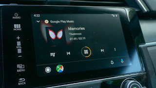
Android Auto has just gotten its first significant update since the platform launched way back in 2015, and it's long overdue. The new Android Auto blends better with car interiors, and the controls take into account how people use infotainment systems. It also surfaces some Assistant features with the help of the revamped interface. There's a lot going on, but here are the five key new features that make the updated Auto something to care about.
Dark system theme
The odds are good that your car interior is on the dark side—probably gray, darker gray, or still darker gray (black). By contrast, the old Android Auto was light-themed all day long. It only switched to a more understated dark theme at night. Google has recognized that car interiors are dark, so now the Auto interface uses darker colors all the time. There are still bright accents, and the font choices make content easier to read at a glance.
Notification hub
Android Auto doesn't replicate all the notifications from your phone, but many messaging apps have added support over the years. The old UI was terrible for managing more than one notification because of the jumbled homescreen. Now, the new notification hub brings it all together.
To access notifications in the new Auto, simply tap the bell icon in the lower right corner. Notifications still pop-over the top of the display as they arrive, but the icon also has a red dot if there are unread items. This screen lists all your pending notifications with options to play, mute, and clear all.
A real app list
The old Android Auto split up the interface by specific functions, but that didn't leave much room for third-party apps to get exposure. The updated Auto has a real app list on the home screen, which makes all your car-optimized apps easy to access. At the top, you always have the four most recently accessed apps. Below that is a scrollable list of everything else.
Google also made some of the most useful Assistant functions into "apps" in the list. Items like the calendar, weather, and news all have a berth in the app list. These icons have small Assistant badges to let you know they're voice-only.
Android's traditional multitasking paradigms don't make sense in the car, but the old Android Auto locked you in far too much. The redesign brings a new navigation bar that makes background tasks easier to manage. If you're playing music or navigating, you can go to other screens and still control that ongoing activity via the navigation bar.
For music, you get playback controls that follow you around the interface. For navigation, the bar shows your next turn. You can also tap the app icon down there to instantly jump back to the app. The new left-justified home button also switches back to your last app if you press it while on the home screen.
More screen sizes
When Google released Android Auto, LCDs were still very new features in cars. Most of them were on the small side, and some didn't even have touch support. Today, automakers are going bigger and wider, but Android Auto didn't know how to cope. That changes with the update.
There will be no more of that wasted space in cars with large, super-wide displays. Android Auto will stretch and reorient itself to fit the screens in cars from Jaguar, Mazda, and others. The navigation bar moves to the side near the driver, and the ongoing notifications move to the right side. It's all part of making Auto look and feel more modern as carmakers finally get with the program and embrace mobile technology.


No comments:
Post a Comment